Category Archives: Design

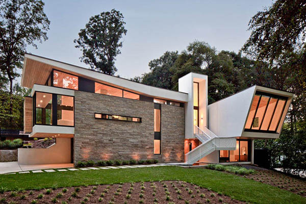
a wing-roofed home in atlanta for dwell mag

Sarvis_02
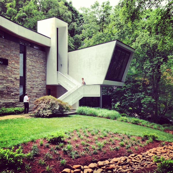
The Sarvis residence designed by Dencity. Photo by Raftermen Photography.

Dwell, a favorite shelter magazine, just published about 200 words by yours truly. I covered a wing-roofed Atlanta home with cantilevered sections that appears ready for flight. You can read the article and see six more photos here. Also, I toured the home in 2013 as part of Modern Atlanta and posted a roundup of my favorite design moments here.

Finally contributing to Dwell feels like closing a circle, because I’ve been a fan since my old roommate PJ gave me my first issue in 2002, when I was writing a craft book. The modern interiors gave me a direction for Abode a la Mode’s “cheap chic” projects, and the magazine has been shaping my personal aesthetic ever since.

modern ‘hood: lavista park, atlanta

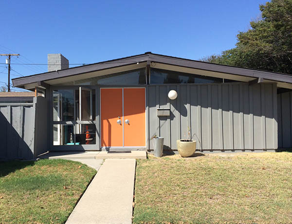
gray ranch with chartreuse door

LaVista Park may have bumped Northcrest as my favorite atomic neighborhood in Atlanta. Why? Location, location, location! While Northcrest has more Brady Bunch-style ranches per block, it’s up in the sleepy suburb of Doraville. LaVista Park, sandwiched between busy Briarcliff and Cheshire Bridge Roads, is a short drive or bike ride to some of the best restaurants, shops, and parks in central Atlanta. Here are 8 midcentury and contemporary abodes that caught my eye on an afternoon drive. All photos were taken by me while standing on public property.


charcoal_600px

white_boxy_600px

click to see 5 more modern homes!

read more  

portraits of today’s lustron owners

chuck5
All photos in this post by Chuck Mintz

When you live in a Lustron, you’re part of a story. The tale begins in 1948, when the Lustron Corporation debuted its prefabricated, all-steel homes manufactured in a former airplane plant in Columbus, Ohio. The company imagined an American landscape drenched in seafoam, pink, harvest gold, and the other enamel hues of its mail-order ranches, but it sold only about 2,500 over three years.

Photographer Charles “Chuck” Mintz picks up the Lustron story today, documenting people who are holding onto these quirky, increasingly rare homes. He has traveled the country over the past couple years shooting portraits of more than 100 inhabitants. After the jump, I’ll show you more samples from his series, including his shot of me and Andrea on our patio.

read more  

modern ‘hood: cliff may’s rancho estates

Orange and gray modern ranch

If I ever build a house, I’ll drop a stack of Cliff May home photos on my architect’s desk for inspiration. In southern California, May was a pioneer of building characteristics that we think of today as the hallmarks of midcentury modern ranches — clean lines, open floor plans, and an indoor-outdoor feel. So on a recent trip to Los Angeles for Andrea’s work, we spent an afternoon in Long Beach cruising May’s Rancho Estates tract neighborhood, built in 1953-54.

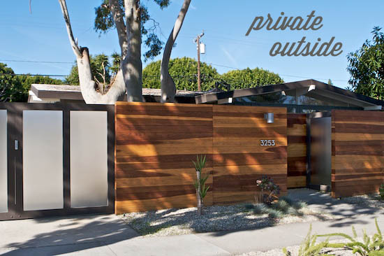
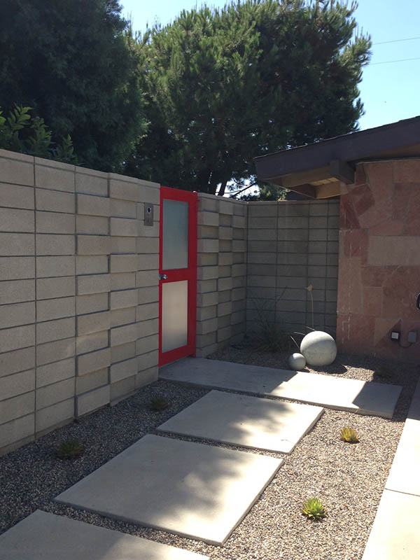
The Rancho homes have opaque facades and high privacy fences that reveal little about their interiors. If you’re nosy curious like I am, you can mine real estate sites such as Rancho Style for photos of light-soaked rooms, swanky pools, and lush courtyards. Although I had to imagine what modern treasures lay beyond the walls, I gleefully shot the sculptural plants, rock gardens, colorful gates, and vintage cars visible from the street. Unless otherwise noted, all photos were taken by me from public property.

Photo via ranchostyle.com

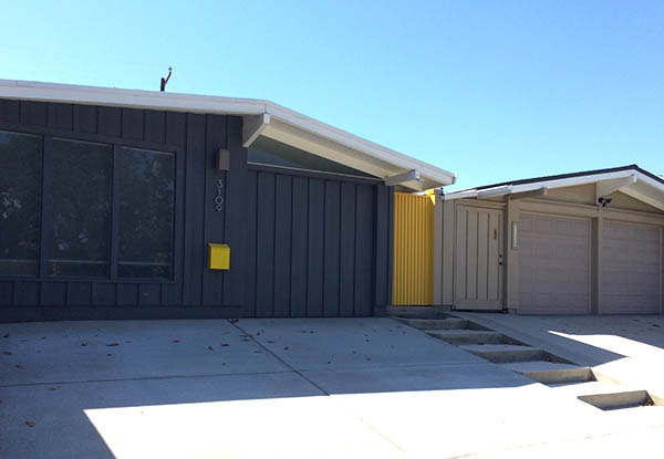
Charcoal and yellow ranch home

Modern concrete and stone courtyard with red gate

click for 6 more home photos

read more  

pops of pastels in my bedroom makeover

master bedroom with gray bedding

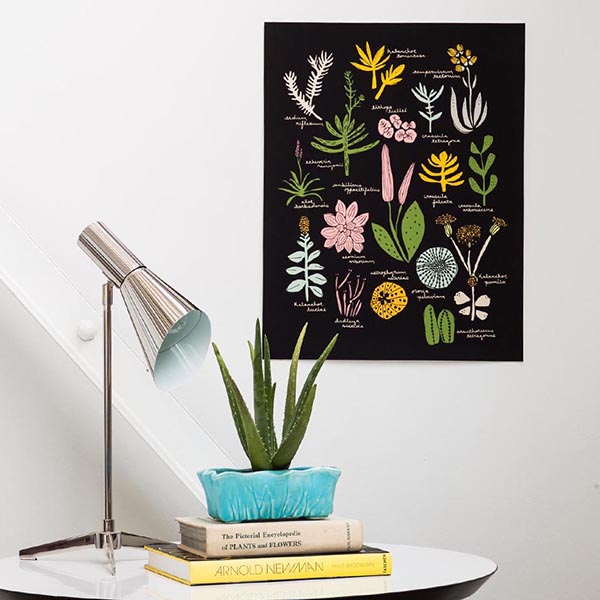
As often happens with dramatic overhauls, my bedroom reboot started with one piece. Over the summer I had the succulent poster I co-designed with Leah Duncan framed to hang over my bedside table. Problem was, the color palette wasn’t jiving with anything else in the room. We were overdue for new bedding and accessories anyway, so I did a revamp using black, white, gray, and pops of yellow and turquoise.

Succulent poster designed by Finely Crafted and Leah Duncan

Below is my side of the bed. We already had the Heywood-Wakefield furniture and vintage ceramic lamp. I’d been wanting a tray so I can set down my earrings, ponytail holder, etc. before I hit the pillow. I styled it with a mini blush planter by Sea & Asters and brought over a Kostick bronze star sculpture from the living room. Geometric patterns to contrast with the botanical art were a must, so I chose a Pendleton wool lumbar pillow from Robin Cottage. The gray braided duvet cover and shams are from West Elm, and the yellow Sketch Grid pillowcases are Room Essentials from Target.

Modern bedside table

Below is Andrea’s turf. The two bedsides used to be mirror images, so I wanted to play with asymmetry by giving him an art cluster and a different lamp. The bird print is his own photograph, hung with gold gem magnets by Lynn Lunger (aka Una Odd). The Minerals print at top right is by Happy Red Fish, and The Last Summer is a painting reproduction by Kiki and Polly. The hanging planter is by ceramist Cathy Terepocki.

Modern bedside table with art cluster

Art cluster

Turquoise and black ceramic planter with succulents

see my revised vanity, an amazing navajo rug, and other photos after the jump

read more